 |
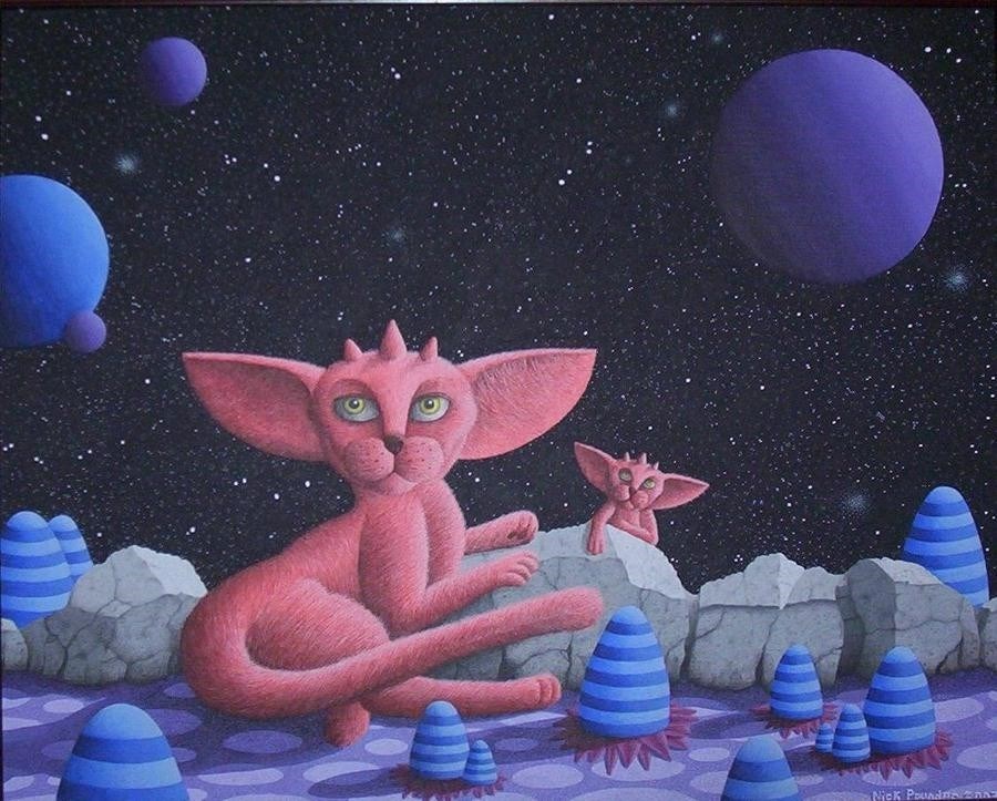
Acrylic; painted over the space of about a week or a medium-sized 18x12 canvas. For this one the planets were blended manually and no airbrush was used. The only problem was "Fimbles" appeared on TV for the first time shortly after, a young childrens' program with stripy characters rather like the alien plants in the picture, and I had a hard time convincing people that they were not based on this! Fairly happy with this one; the only downside is the smaller cat; it was supposed to be more of a kitten but the face unfortunately looks more adult than I wanted. |
 |
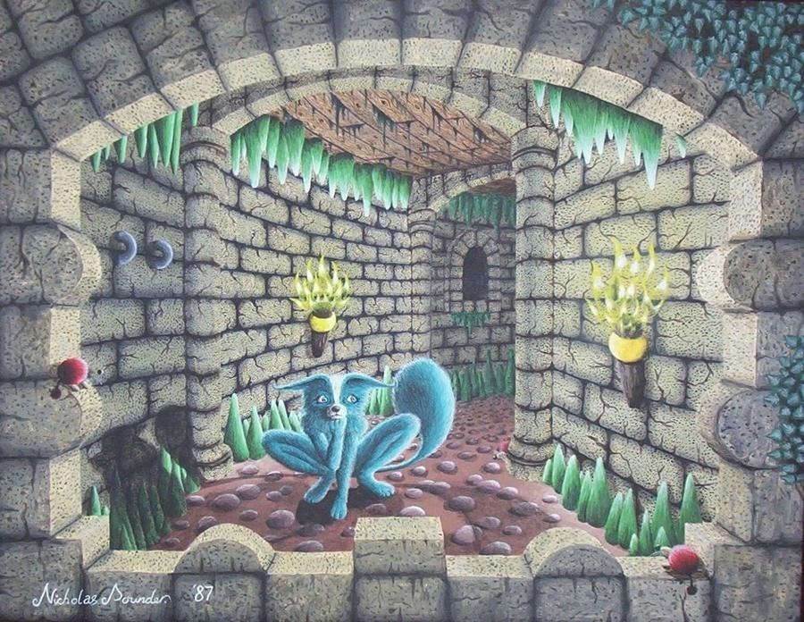
An early attempt at stonework, so a castle corridor seemed appropriate. I liked an artist at the time called Rodney Matthews and I was half hoping to imitate his style in a loose way. The style of the flames were copied directly from an album cover by Derek Riggs, but the rest is pretty much straight off the head. |
 |
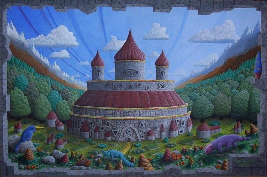
This took about ten years to finish! By the time I started to paint the trees on the other side, so much time had elapsed that my technique had changed and the trees on the left and right of the castle look slightly different as a result. The other noob technique was to use a thin acrylic wash for the shading on the castle stones rather than a normal blend of thick paint. It's not visible in this photo, but the painting was done on bumpy hardboard; this means the castle stonework looks kind of 'dotty', almost woolen, a totally unintended effect. Lots of people have since praised it for its wooliness, but this was completely by accident. |
 |
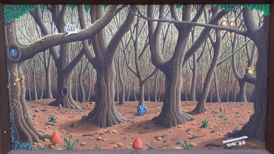
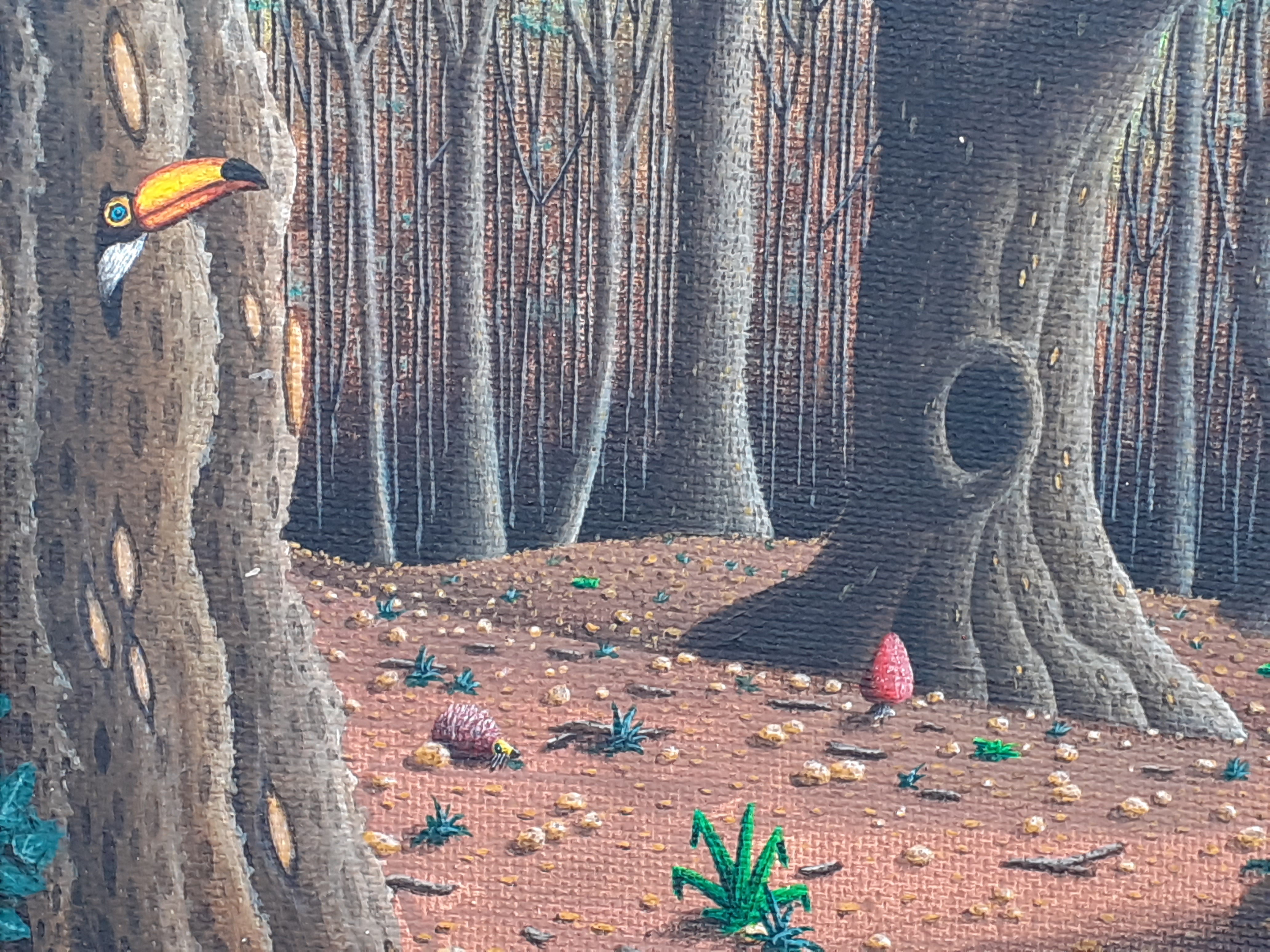
This was painted on the back of a bit of hardboard, so it gives it an unusual "bumpy" texture. I took some photos of the local woods, not for the big trees but to get the background right; what became apparent was this layer of light blue for the sky and a general brown getting darker towards the woodland floor. This was done as the first layer and then I worked to add detail on top. |
 |
Detail from the above, showing the knobbly surface a bit better. |
 |
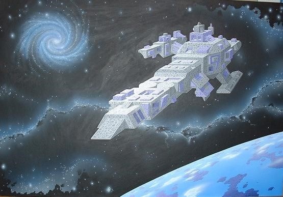
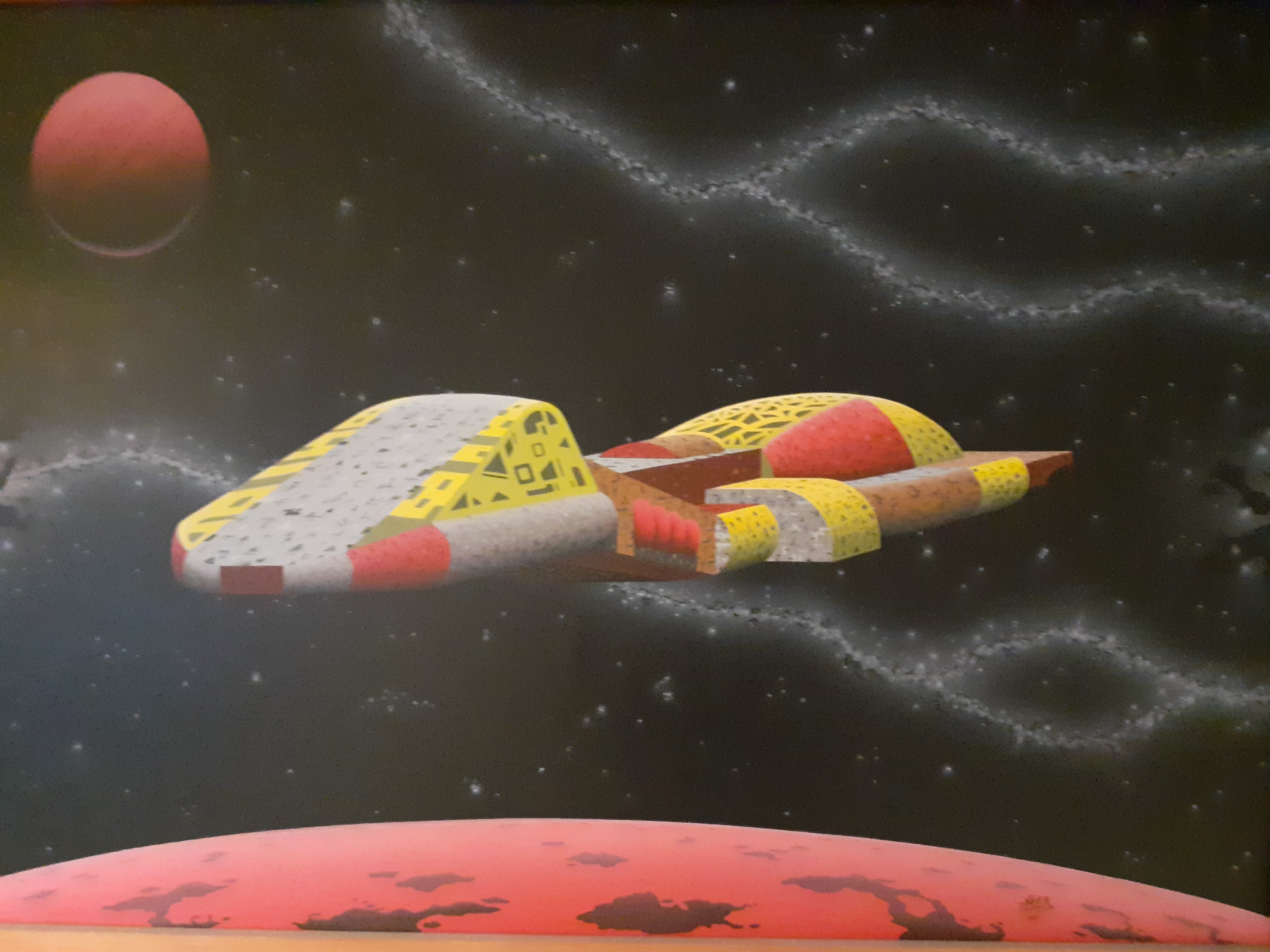
Spaceship indulgence time... For this, the curve of the planet was drawn using a pencil tied to a long bit of string; holding the pencil upright with the string taut gave me an accurate curve. The planet was then mainly airbrushed except for the islands. Next bit was to do the nebula and the stars; unlike the cat picture an airbrush was heavily used for this: Stars first, then airbrush, then working over the sprayed area manually again with the brush to give the darker regions. The spaceship was entirely hand-painted. Canvas size was 24x18 inches. Not the best photo as there is a lot of light reflection, I will do better one in time. |
 |
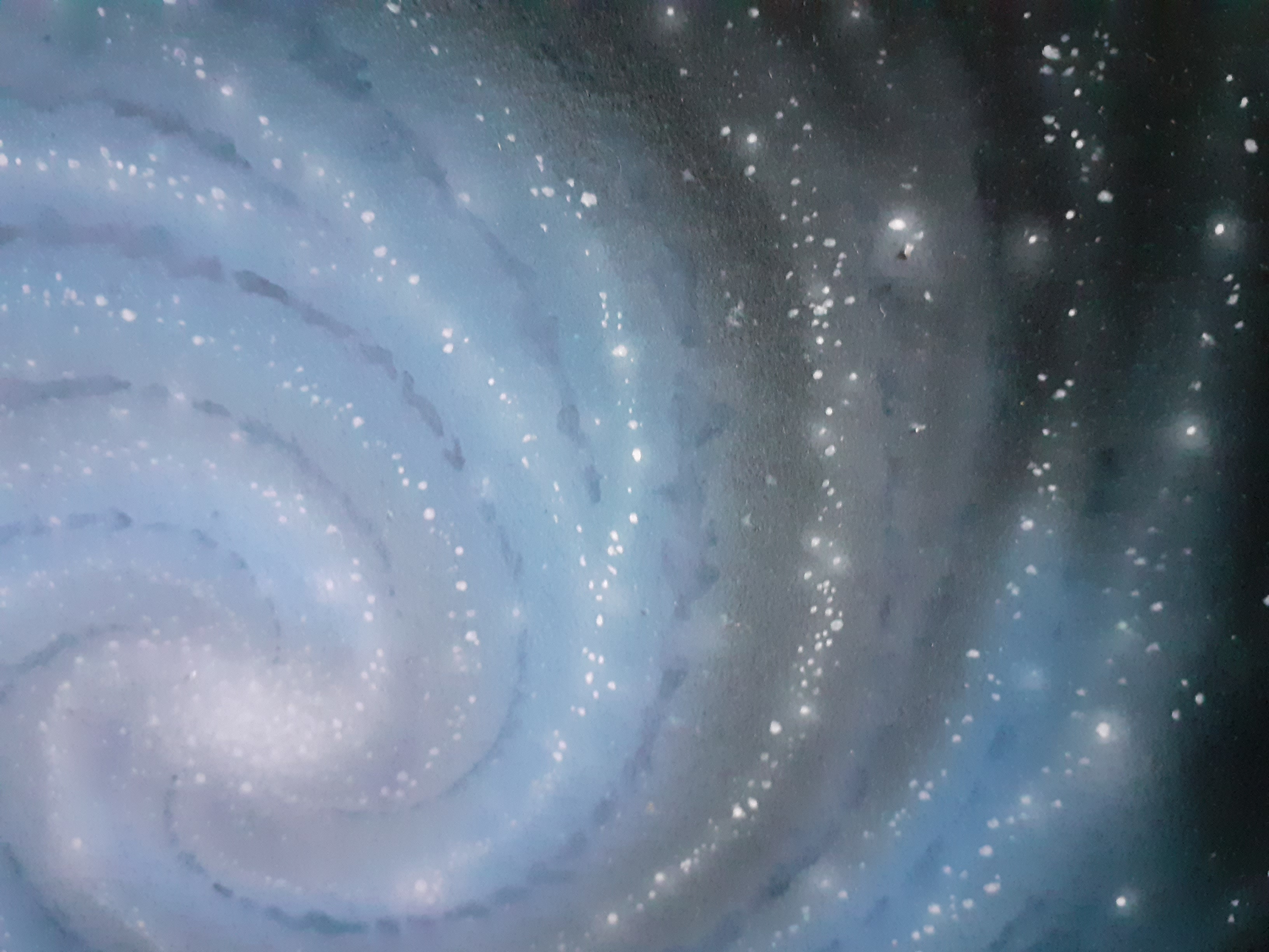
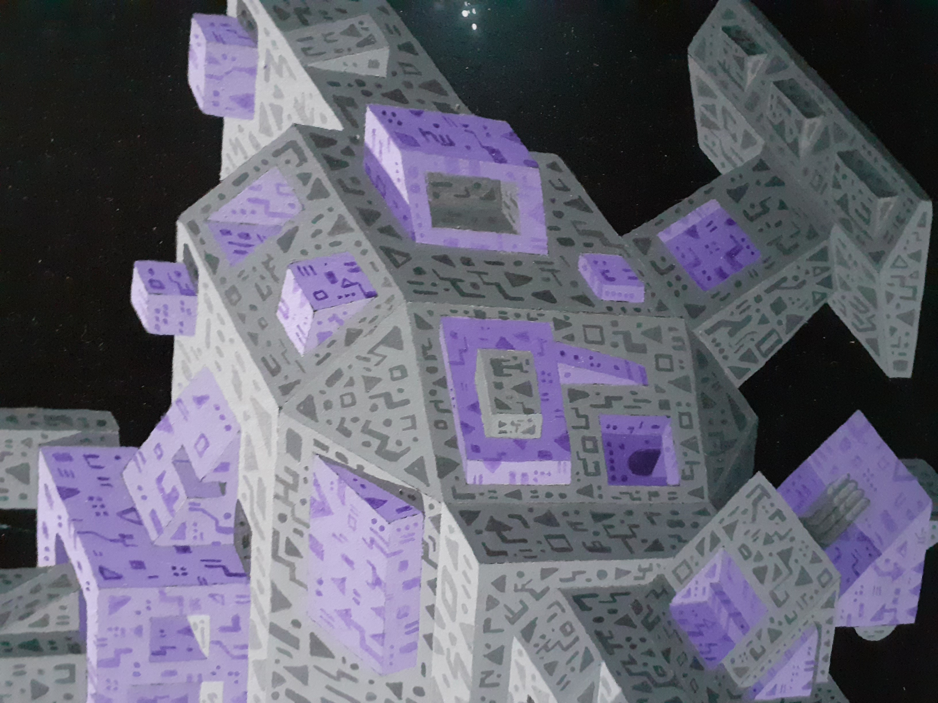
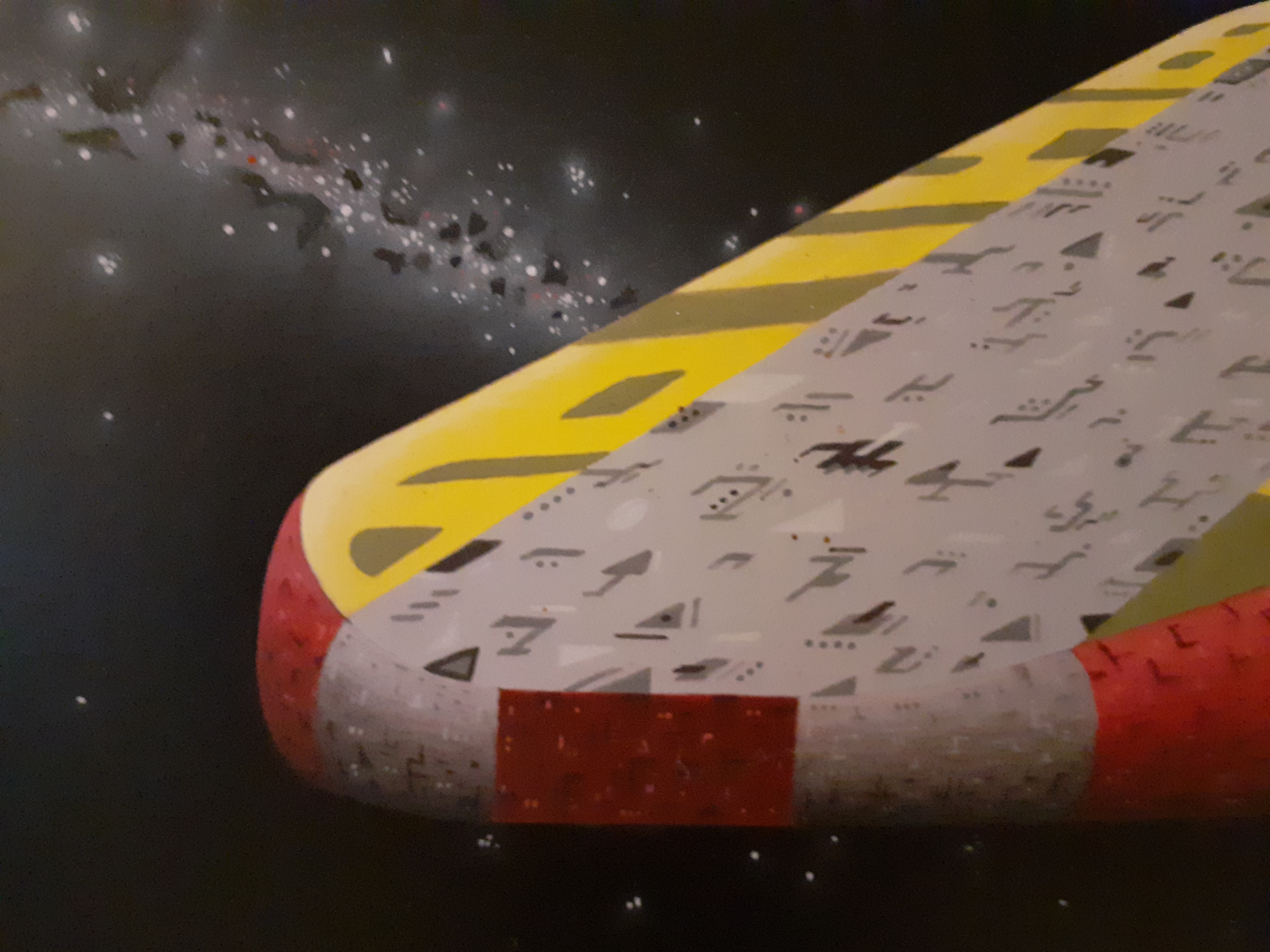
Detail from above... |
 |
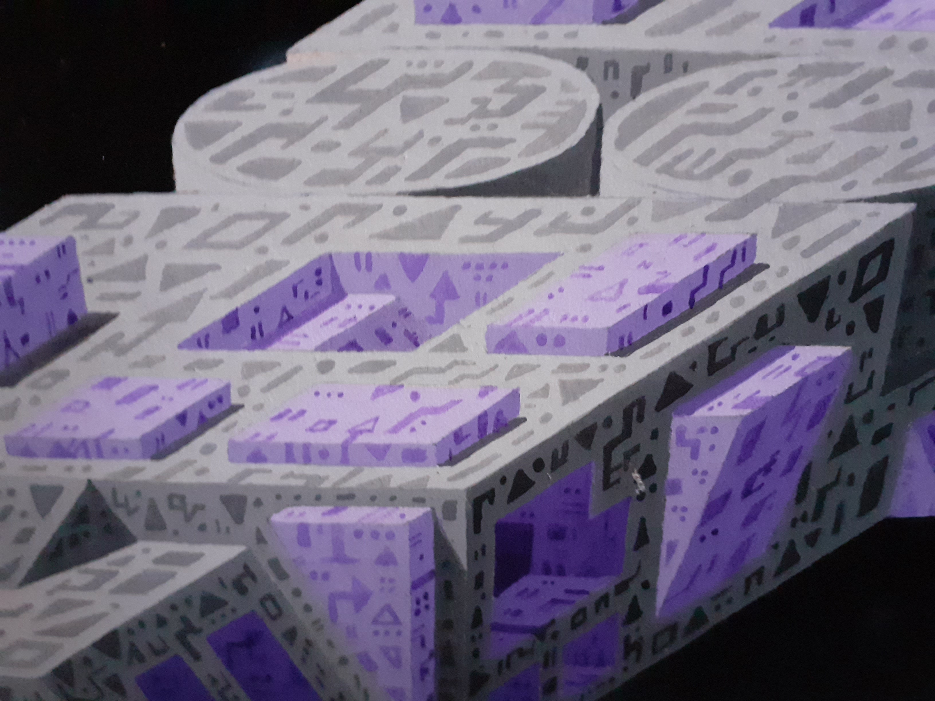
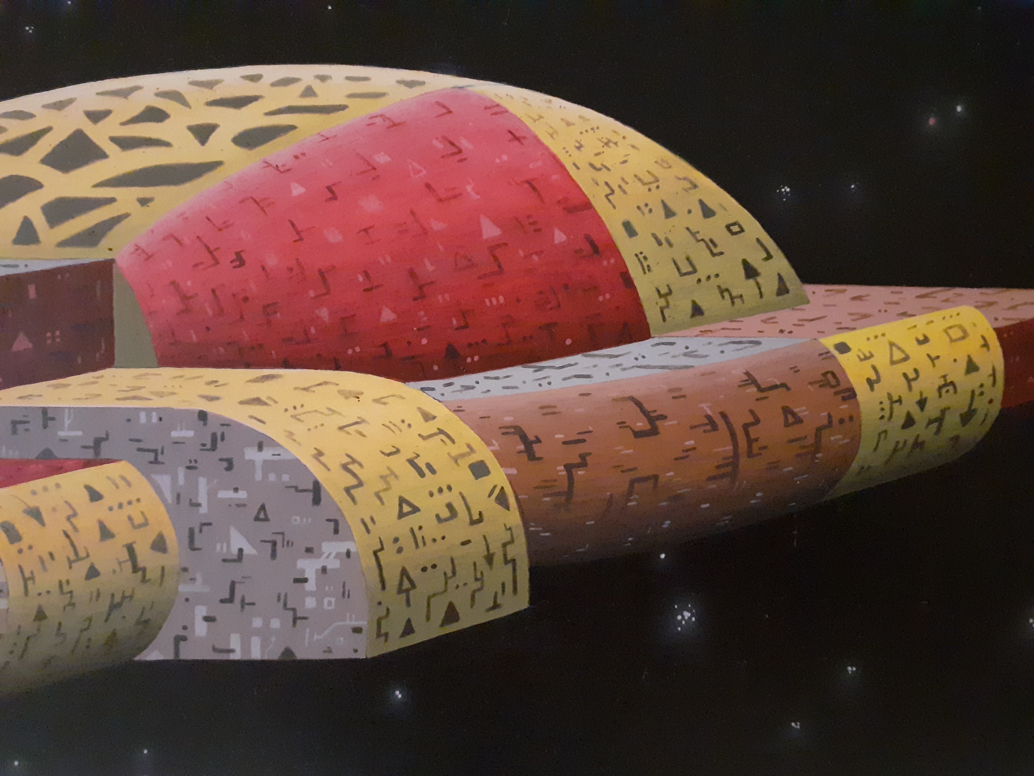
More detail from above... |
 |
More detail from above. |
 |
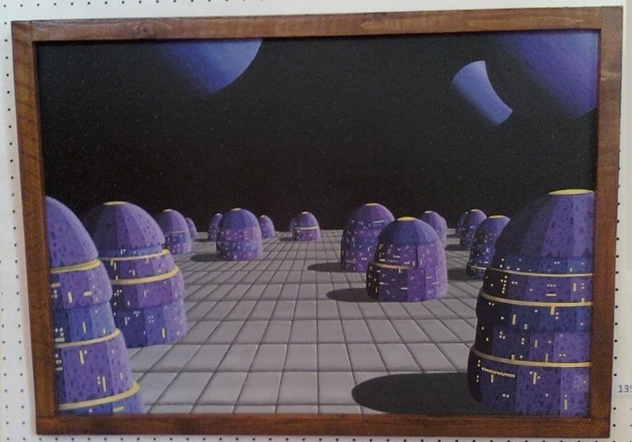
The local art show had come around and I had been too busy to prepare anything for it, so this was one of those all-out paint-it-in-three-days-solid efforts. Worth it as it sold on the first day of the show. It is entirely brush painted in acrylic, with a kind of 'fake' perspective in use: The receeding lines were calculated in a similar way to the fret positions on a guitar, by deciding how much deeper the foreground squares were compared to the back ones, deciding how many rows I wanted and then taking logs to get a multipier. |
 |
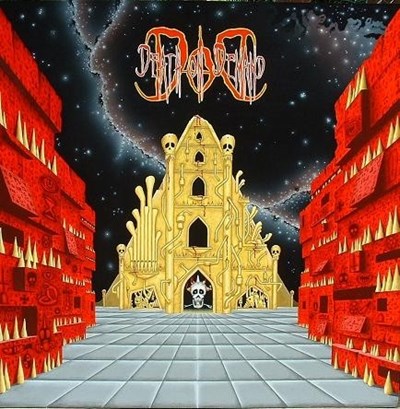
A musician had seen the picture above at the show and commissioned me to paint this as an album cover for his band, the theme being "Cyber Cathedral." I jumped at the chance as I had an instant vision of what such a thing should look like - a space structure with the organ pipes on the outside, and heavy machinery inside the building. As you can infer, it is a heavy metal album, the band being called "Death on Demand." As such, the logo design was entirely their own and reproducing it was a real challenge - I had to make an intricate cut-out, glue it down, spray over it, peel the cut-out off and then work from that. All brush painted in acrylic apart from the nebula type effect in the sky. |
 |
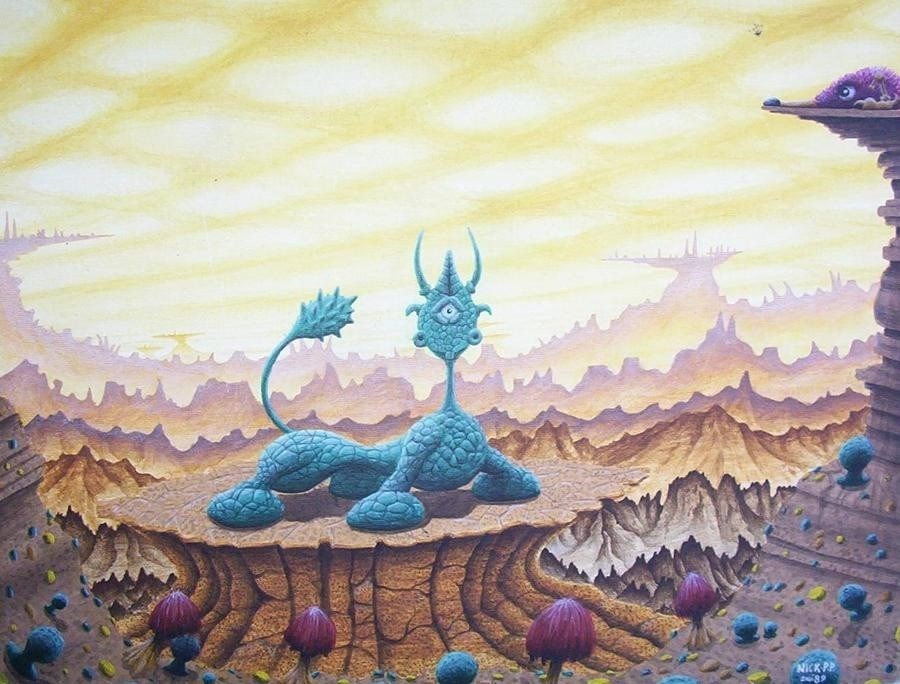
It always surprises me that nearly all professional artists' attempts at drawing 'alien' creatures always seem to be based strongly on the anatomy of our own Earth-based creatures; very few people have success in coming up with a unique structure that doesn't look a bit silly. I tried to distort the body shape here a bit but to no avail, the overall structure of the animal is still totally recognisable. The sky was done before I owned an airbrush, using layer upon layer of thin wash acrylic. |
 |
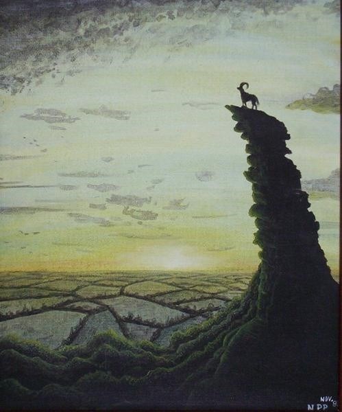
The goat and high rock pinnacle are secondary considerations here; the main goal was to create an ethereal glow to illuminate the fields, very happy with that part of the picture. |
 |
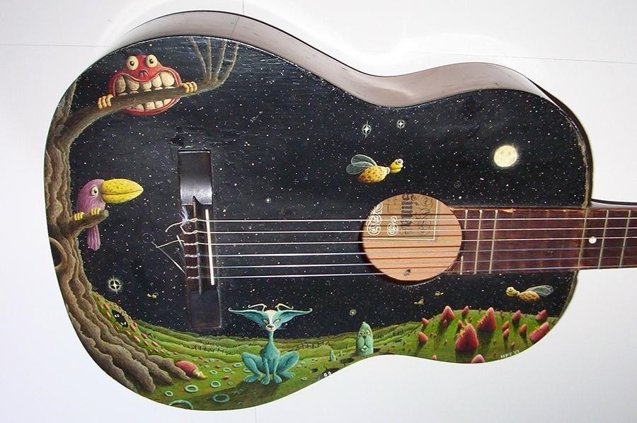
The guitar had a warped neck so was ripe for experimentation. Comments over the years have varied between "Gorgeous" and "I don't want to touch that thing with that many floating nightmares on it." |
 |
Straight copy from a book, with some somewhat surreal stonework added in. |
 |
Again, trying to imitate Rodney Matthews's style, but in pure acrylic with no inks and no airbrush! Google his work and you'll see lots of these types of cities. |
 |
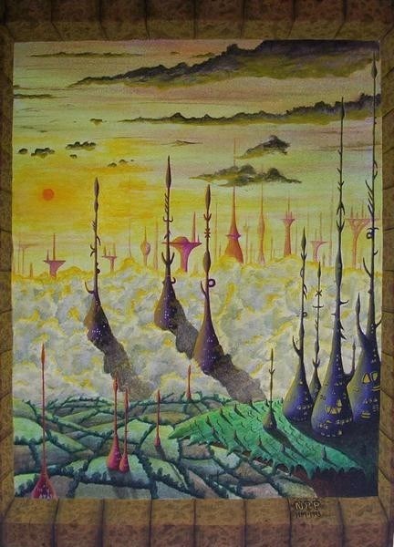
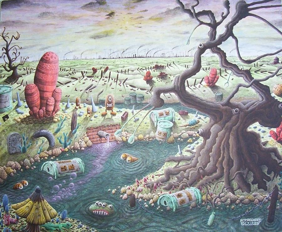
Green issues were coming to the fore in the public conscience in the late eighties and this was my teenage statement on the issue. The cactus-y things were actually inspired by an early 8-bit computer game which featured crystals of a similar structure. I was working in a laboratory at the time, developing a growing mistrust of chemicals and food additives. |
 |
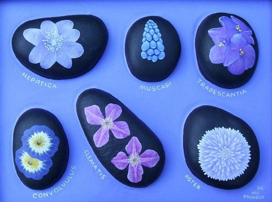
An experiment all round; cavities drilled out of thick MDF; stones araldited in and the gaps filled with wood filler. Although the flowers are reasonably accurate, they seem quite 'flat' apart from the one on the top right. |
 |
An experiment in slightly odd, exaggerated perspective. Good fun to paint. Airbrush used for the nebulae and stars, the rest was all brush painted. |
 |
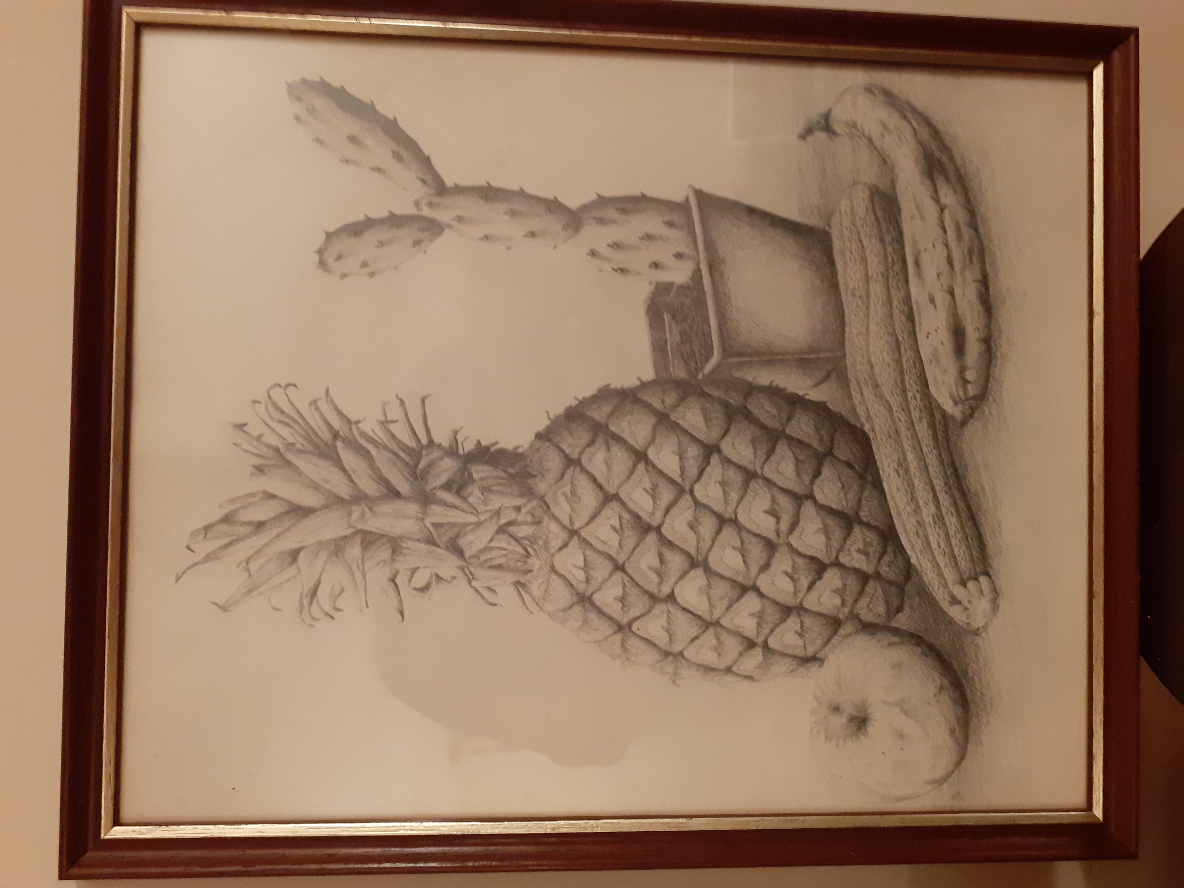
Goodness, drawn in 1988 during my art A-level exam. A good excuse to use some license to exaggerate; the banana wasn't really that mouldy. |
 |
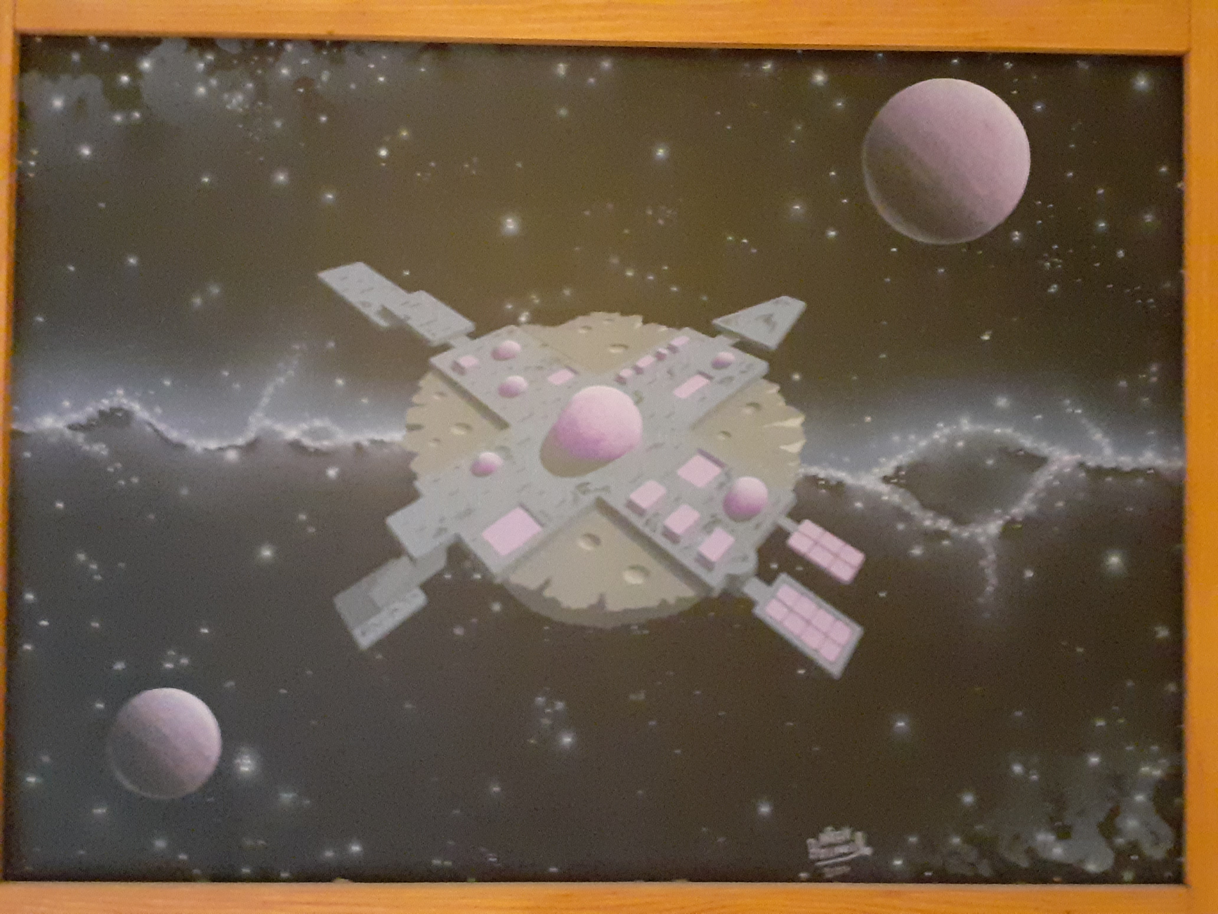
I was pleased with the detail on this but not the overall sheen; a bit of a technical disaster: To bring out the black of the sky, I usually paint acrylic varnish on, but in this case something had gone wrong with the varnish and it blistered in places, meaning I had to take the lot off with a wash of white spirit. Unfortunately that also took away a tiny layer of the very finest spray particles from the airbrush, leaving the overall appearance "flat." |
 |
Detail from above. The whole idea of this piece was to try to recreate something that the artist Chris Foss might come up with; unfortunately the varnish malfunction put paid to any glistening sheen it previously had. |
 |
More detail from above. |
 |
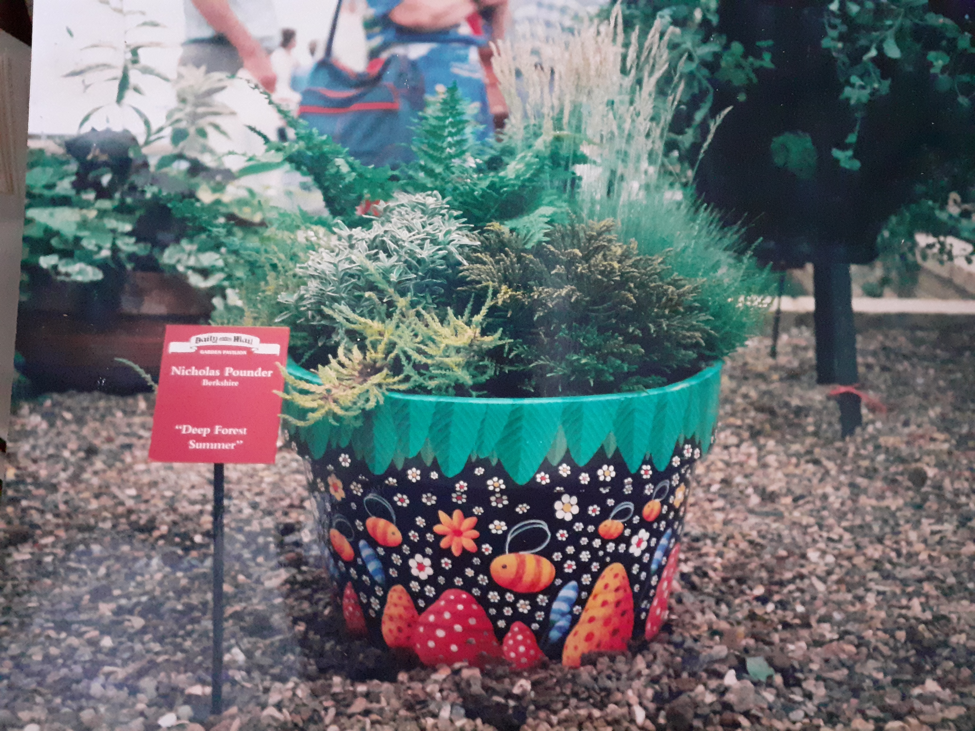
A competition in the newspaper, around 1990? Design a planter and fill it appropriately. Made the finalists for the show :-) |
 |
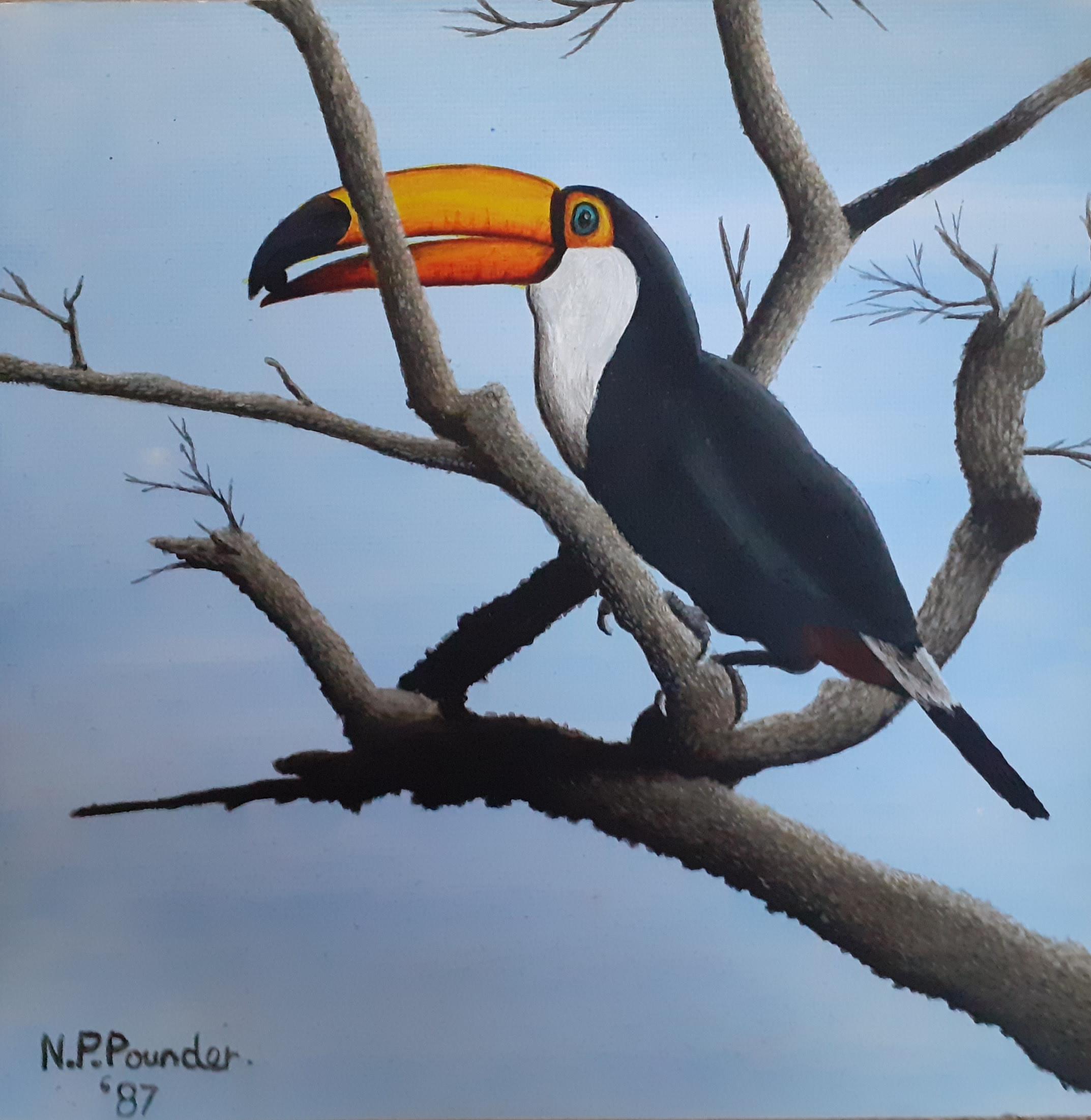
I love toucans; this was copied from a much smaller picture. |
 |
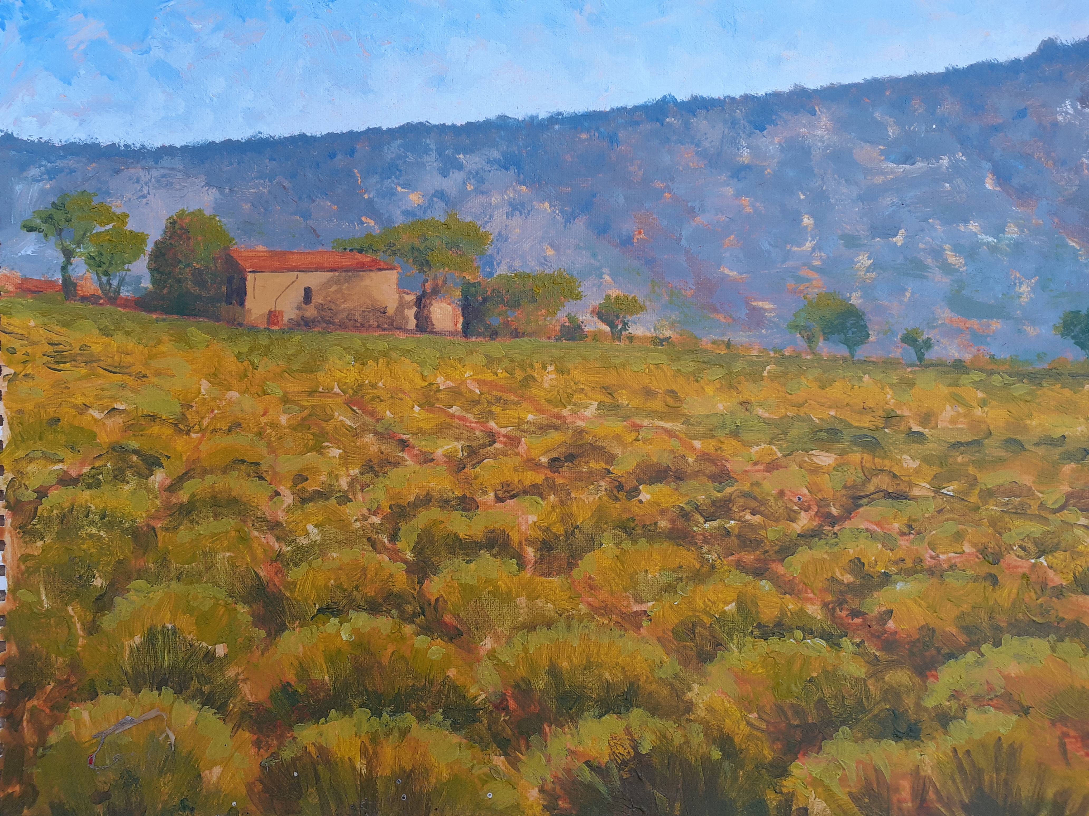
A couple of hours' effort one night at Reading art club. We had a guest artist who was trying to get everybody to paint in an impressionist style. Not sure what Monet would make of it, but it was good fun to do. (The guy actually banned us from using black paint as a shade on this, it had to be Paine's grey, he was quite insistent!) |
 |
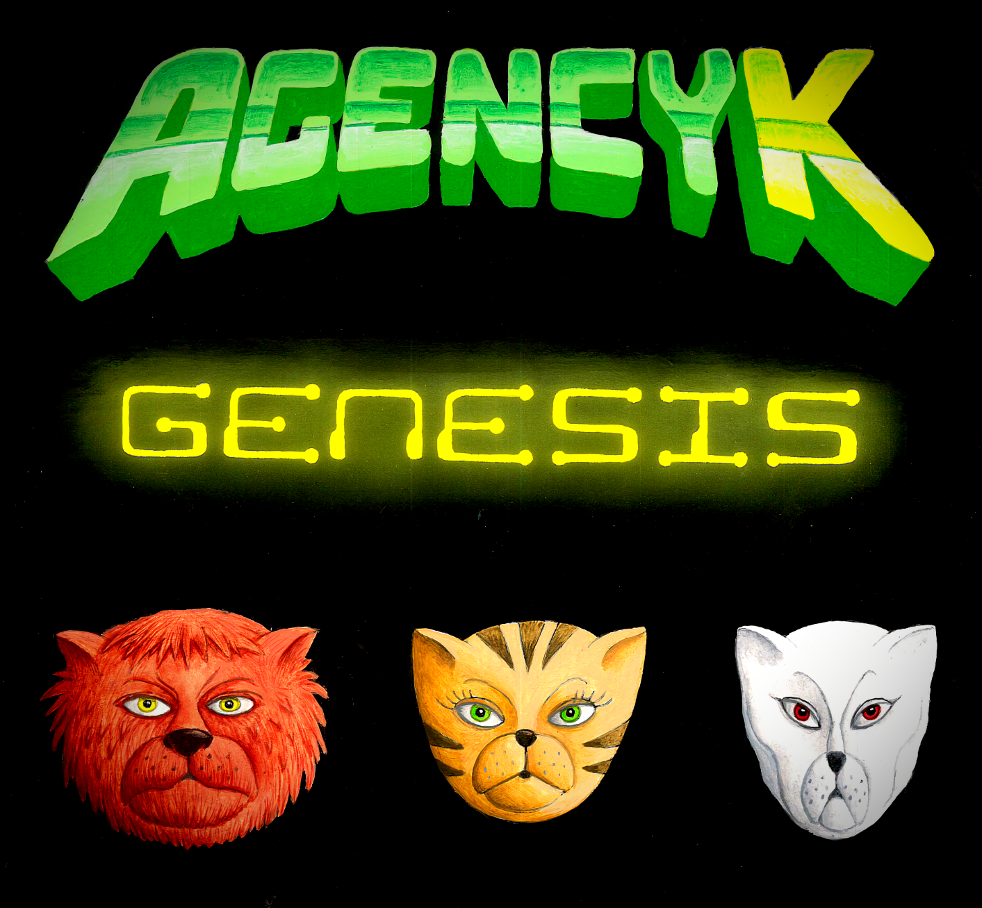
Artwork I did for my own book... The original image is acrylic but this has been rather processed by computer to remove reflection effects. |
 |
Here are the unprocessed cats from the above picture, direct from a photo, interesting to compare. |
