 |
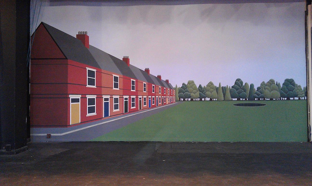
Terraced houses; this took somewhat longer to paint than I thought. The excess time was taken not in the bigger houses in the foreground but in the smaller ones at the back of the terrace, requiring very small brushes normally used on a small canvas painting. The perspective was generated with the simple "box-and-diagonals" method and the paint as usual was a mixture of emulsion and artists' acrylic. The original intention was to have another row on the other side, but it was not to be due to time running out. |
 |
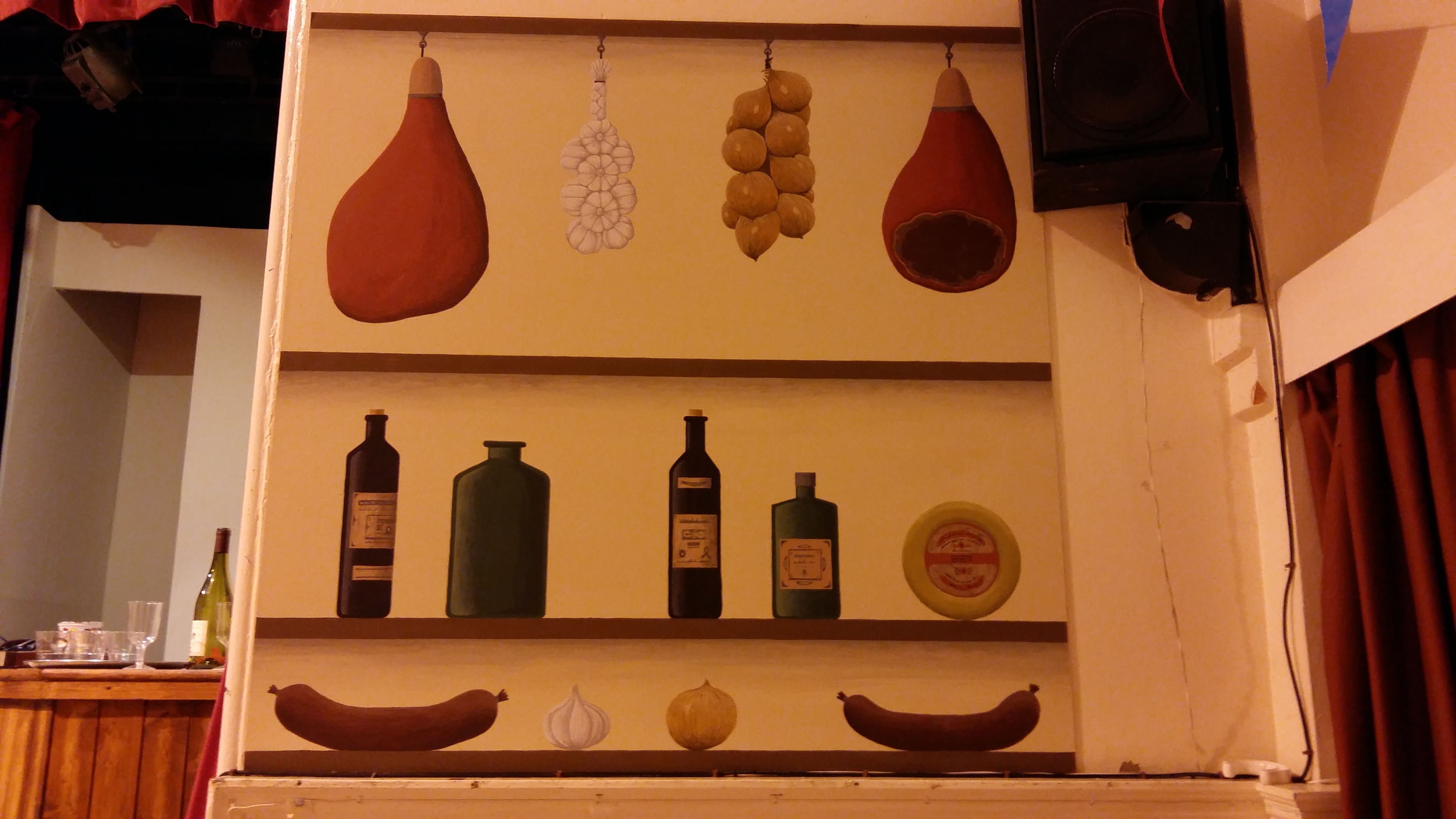
This was just one piece of many for a production of Allo Allo. All acrylic. The garlic was probably the most difficult to get right; the bottles I'm very pleased with but probably the hardest thing to get right was the two hams because the surface colour was supposed to a kind of "cured meat" red which I struggled to get. |
 |
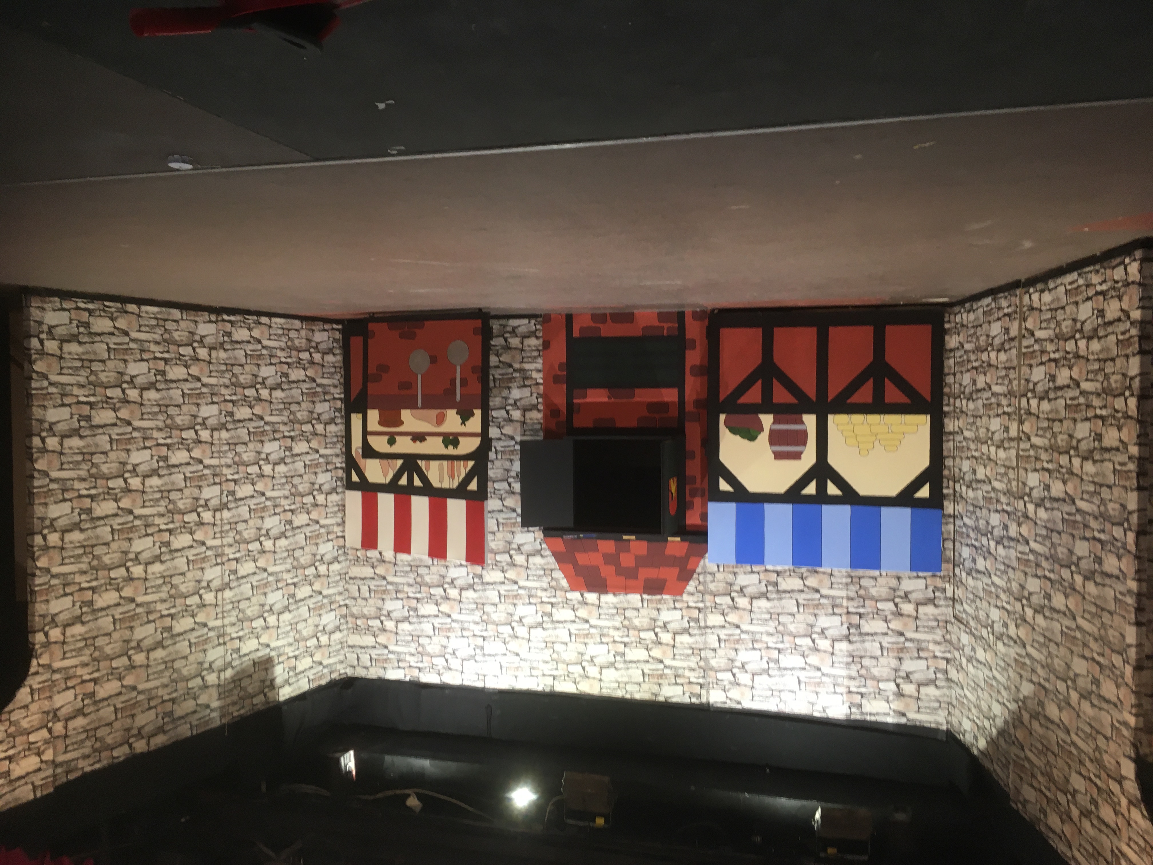
The sword in the Scone was a fun panto and I was given three tasks: a) Come up with a kind of middle-aged wall stove, b) come up with barrels / a general market scene and c) I was given a large lump of expanded foam and told to make it look like a giant scone, burnt on top, all of which had to be a bit cartoony. |
 |
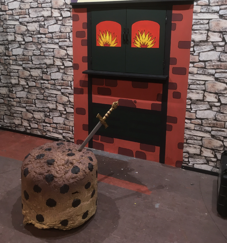
Here's a close-up of the oven and the scone. At one time I would have probably attempted to paint a stone wall as well, but the crew were nice to me and this time managed to source some rolls of stone-effect wallpaper. For the scone, the big airbrush came to the rescue giving the darker, graduated tone on the top. |
 |
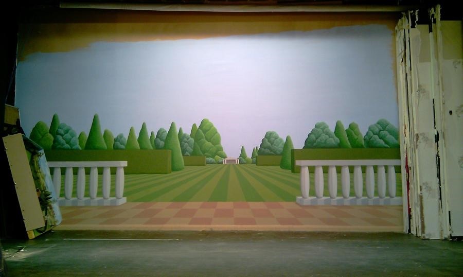
Backdrop for the "Amorous Ambassador," the remit being a large posh garden fitting of a senior diplomat. Overall perspective was good but the patio slab calculation went awry, giving the distorted effect. All a good learning exercise. |
 |
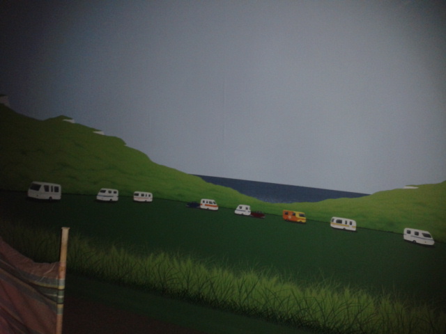
"First day in august" - a play set in an old-fashioned caravan site. I seem to remember a lot of this was hidden by a tent during the play, so as long as audience could get a glimpse of some caravans and the sea that was OK, hence lack of any detail in the middle. The wisps on the hills at the back were done with a small airbrush. |
 |
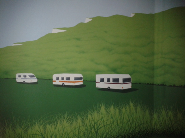
Some of the caravans close-up. They were supposed to look old-fashioned, but not ancient. Despite the perspective, they looked quite flat until the shadow underneath; one small addition making a big improvement. |
 |
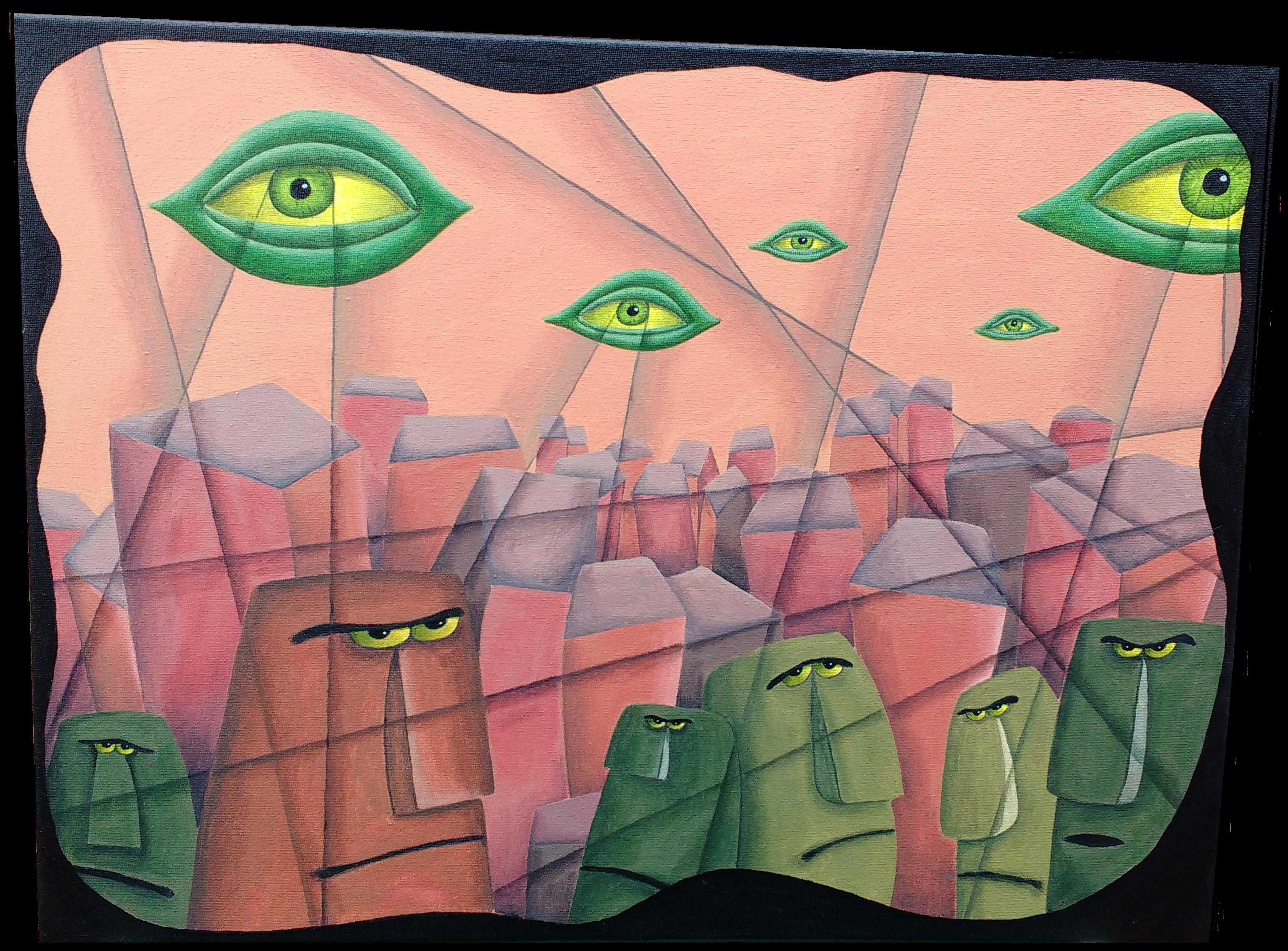
In this play, there was a certain amount of dialogue taking place in a lounge concerning a framed work of modern art of questionable quality hanging proudly on the wall. So we needed a modern art parody... The inspiration for this was those awful "Easter Island Moai miniatures" you see everywhere in garden centres - not the ones that actually do look like the Easter Island Moai, but rather the ones with the silly expressions that make them look as if they are dealing with a bad case of Stomach-ache. Truly Awful. |
 |
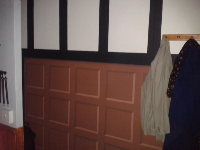
Wood panelling, nice and simple but a lot of work in the drawing out. Not really a natural wood colour I admit - but sometimes when time is against you at two in the morning you have to mix those surplus pots of brown as best you can. |
 |
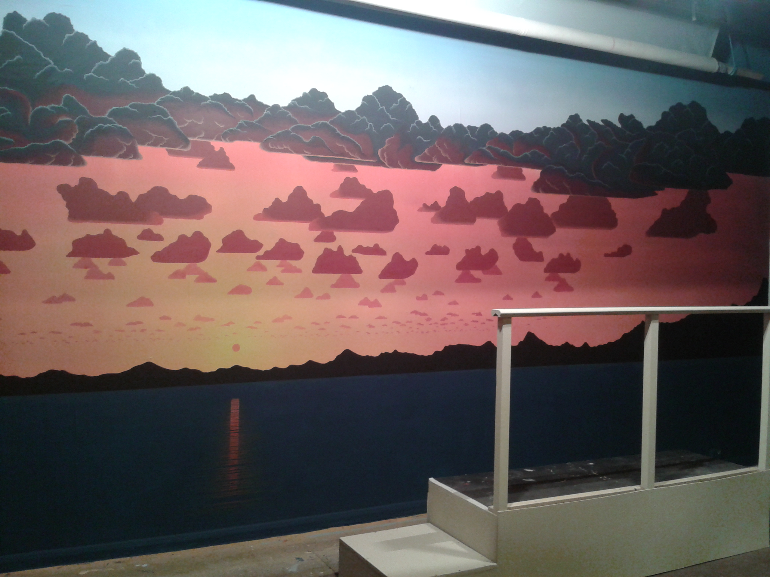
This was for a revue set on a cruise ship. This was the most work of all backdrops to date, mainly because I had to bring in some scaffold towers to lie on to paint the clouds. The overall orange glow was done first with the big airbrush, then the clouds, the sea and finally the rippled reflection on the water. Very pleased, but even better, the play required a switch to a moonlit scene, which would have required another painting on a pull-down roll, but we had just upgraded the lighting system to professional quality LED's - these instantly converted the orange to blue and the sun to white! I'm not sure how those clever people in the lighting box managed to pull that off, but very glad they did. |
 |
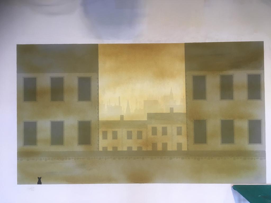
I think this scene was only seen for about 3 minutes in the entire play up to the point some curtains were drawn. It's not obvious from the photo but there are at least half a dozen layers to the cityscape receding in the mist. The smog was added with the airbrush at the end. You can see the remnants of a previous play's artwork underneath; this was below the line of sight of the audience so it wasn't necessary to white it out. |
 |
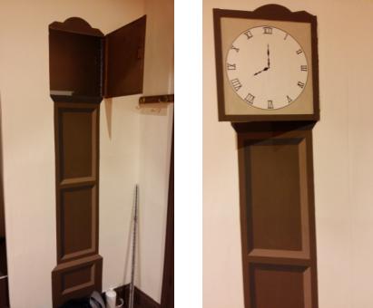
Nice simple grandfather clock, simple light-dark 3D effect. Again not natural wood, but a mixture of waste browns. |
 |
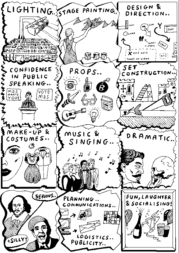
Sometimes we try to drum up interest and look for new members, this is one of my early attempts at a small A4 poster. Done entirely in fine-nib ink pens, with nib size about 0.5 mm. |
